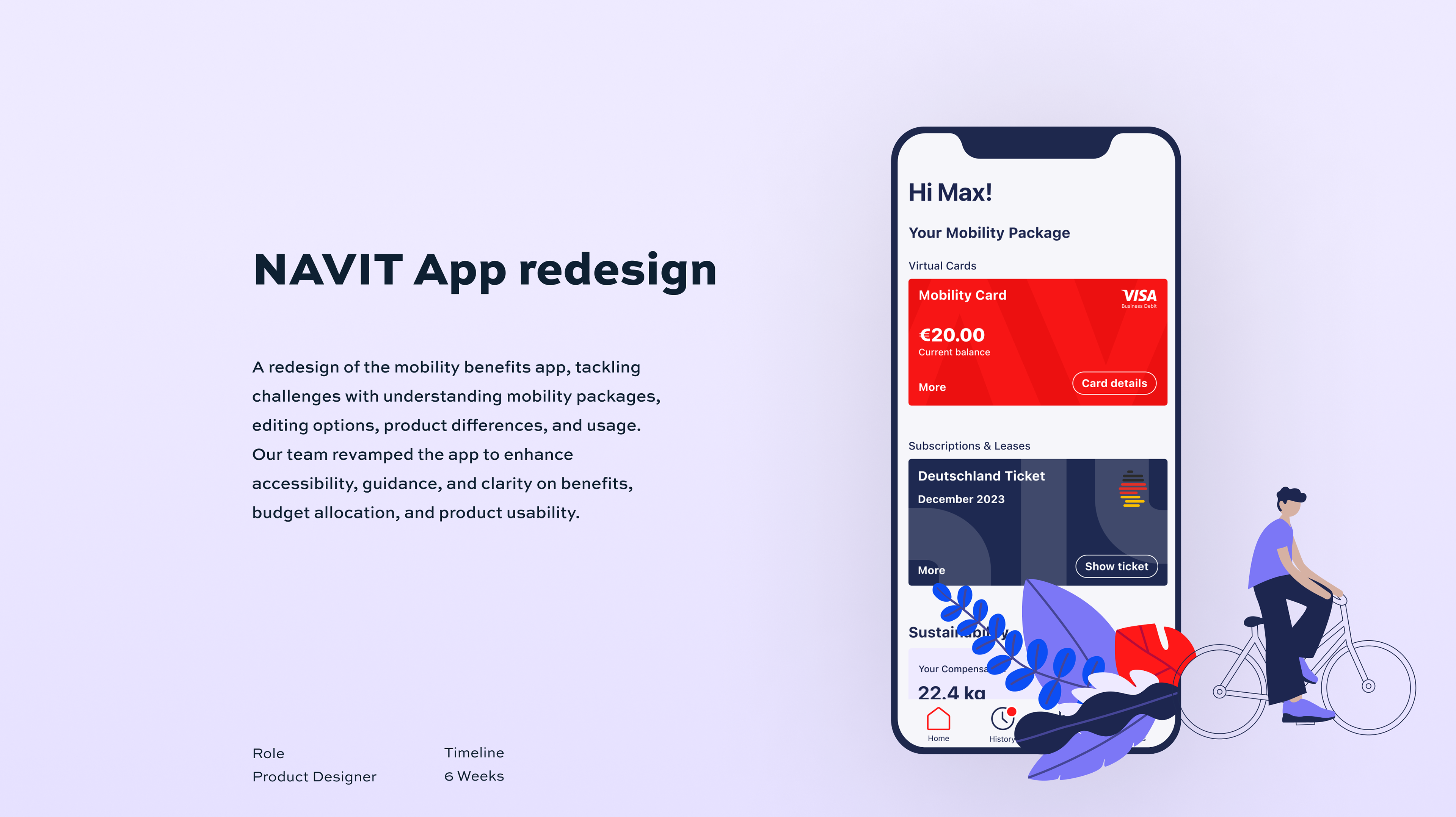
Problem
Users lack a clear understanding of their mobility package, editing options, product differences, and usage instructions. This leads to frustration, confusion, and a decrease in perceived value from NAVIT. It also contributes to an increased support workload.
Solution
We redesigned the app to provide users with better access, guidance, and clarity regarding benefits, product usage, and budget limitations. Our aim was to enhance transparency and improve user experience.
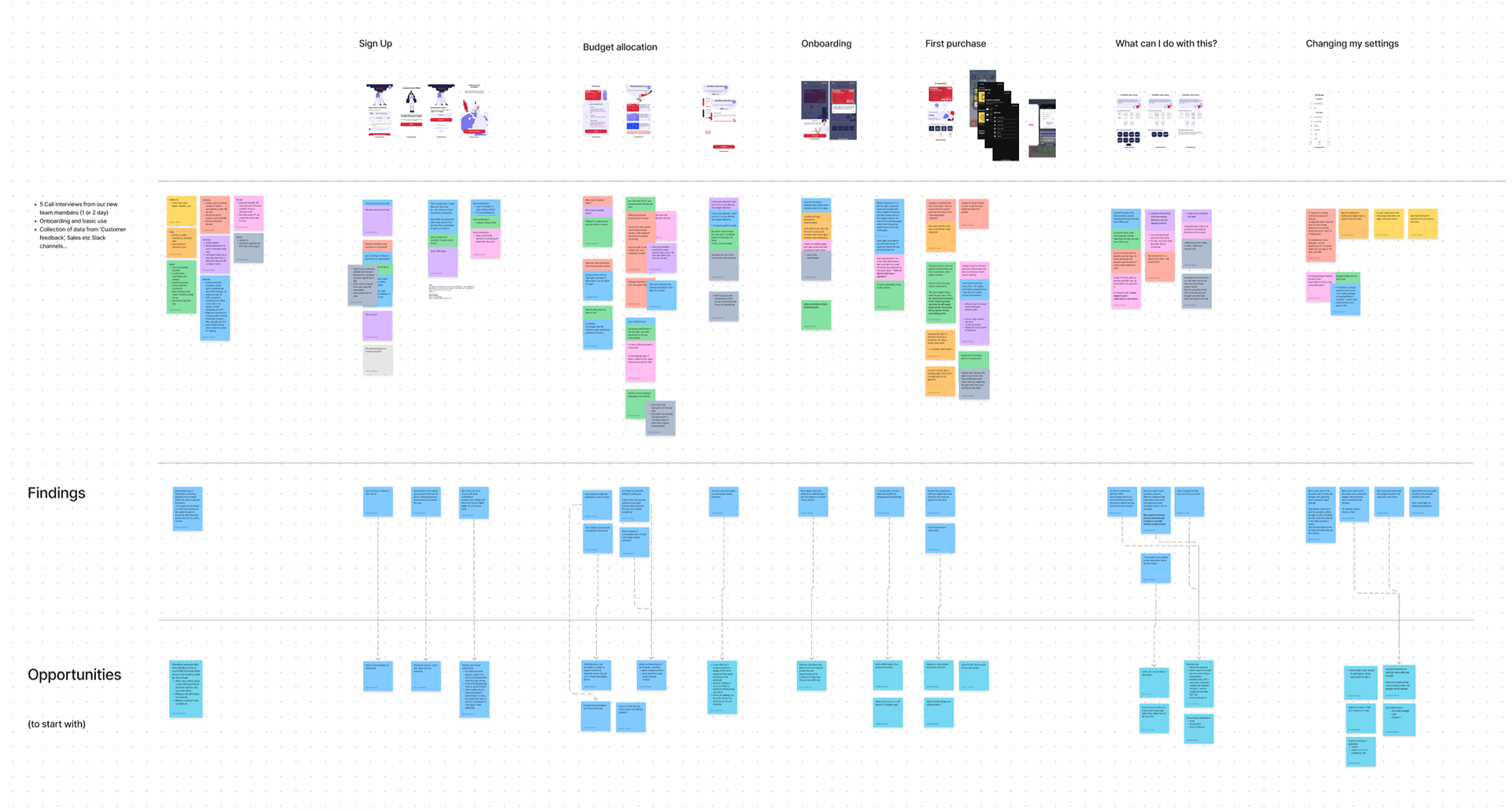
Research
Findings
Through implementation of continuous research into our process, we found that:
• Users lacked clarity on whether they could change their options and how
• Users struggled with understanding how to use products and spend their allocated budgets
• Limited understanding of mobility packages and their functionality
• Confusion caused by changes in budget allocation
• Unclear differentiation between products, worsened by a card-based visual representation
“I don’t know why anyone would choose public transit or bike leasing if the red card includes everything”
User Interview
Supporting Data
• Only 37% of users had created a single product, despite 77% having the option to create multiple products
• On average, users waited 47 days before creating a second product
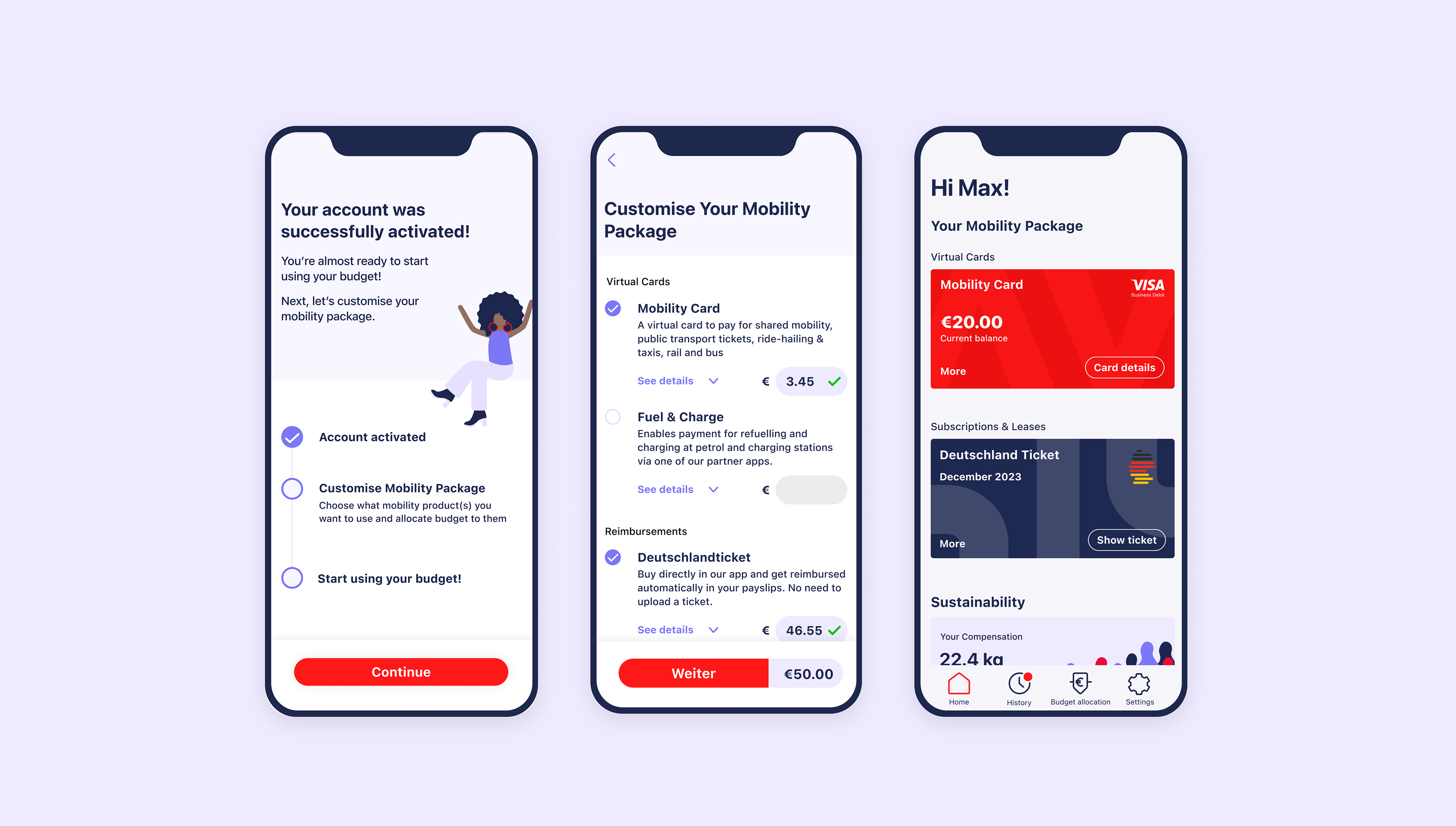
Solutions
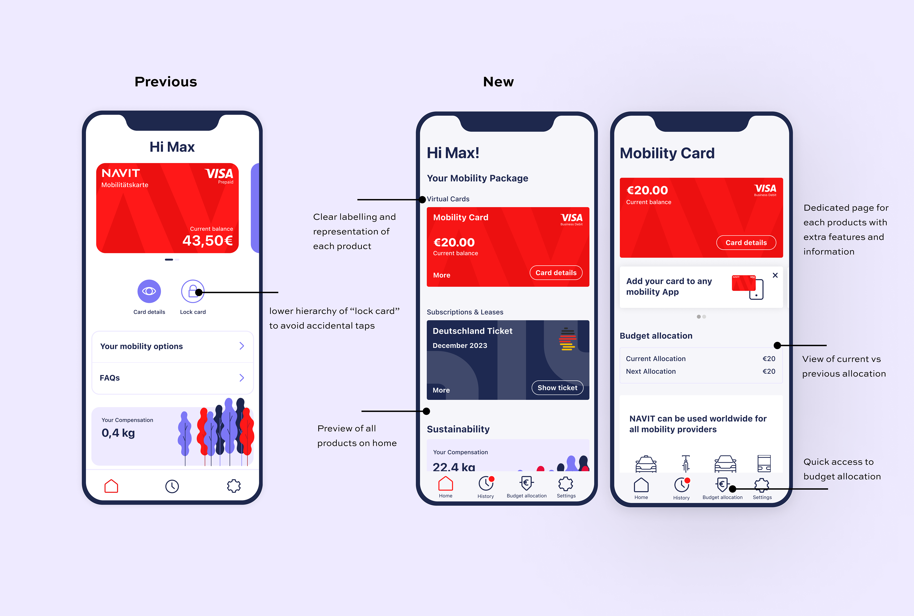
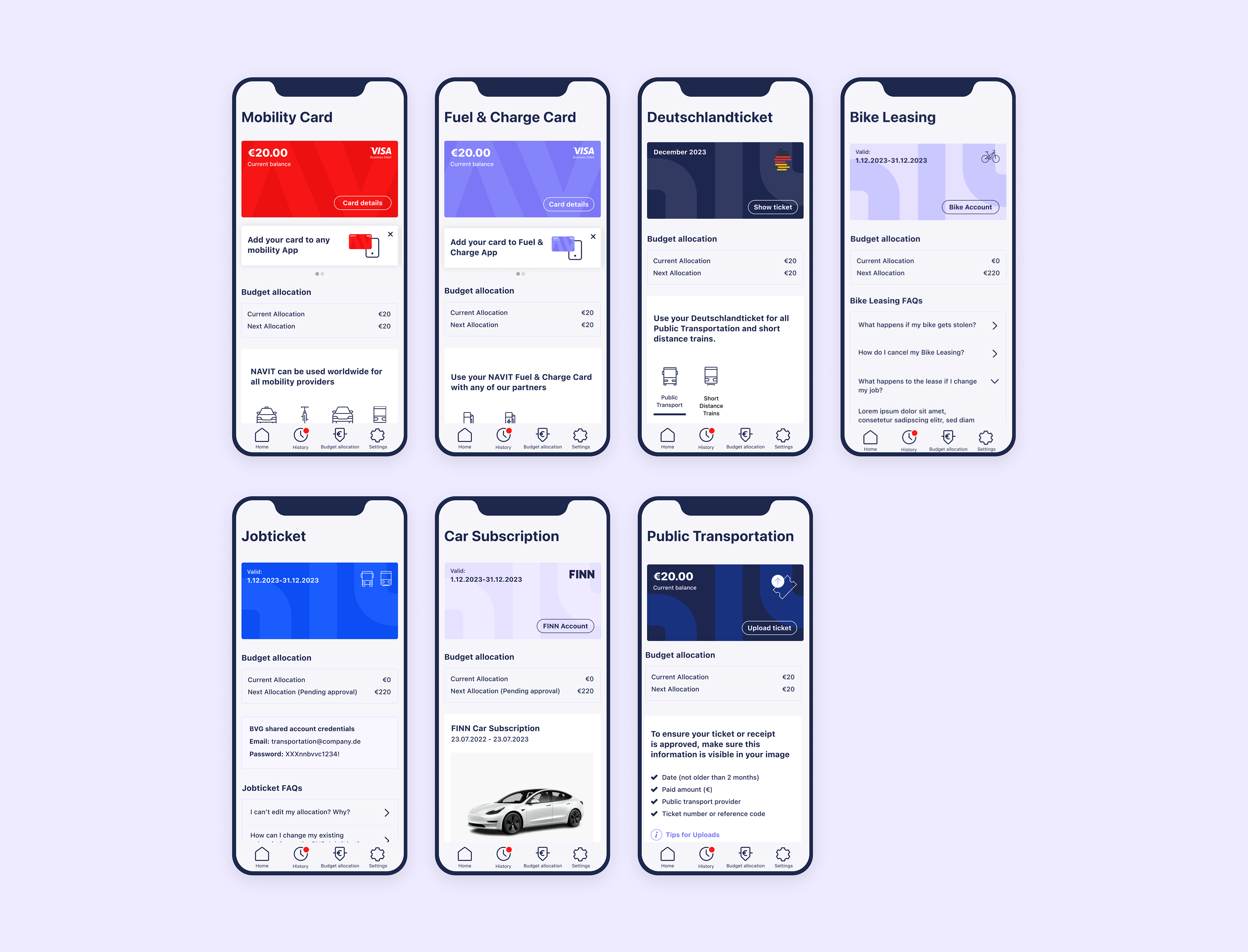
• Simplified and clarified onboarding flow: Combined product description and selection on one screen for ease of comparison and selection
• Provided a comprehensive overview of all user products on the home page
• Improved accessibility to the budget allocation screen
• Removed card representation for non-virtual card products, eliminating confusion
• Tailored guidance for new users on their initial purchase
• Offer language selection before logging in
“this flow is more to the point about knowing what services are available, compared to the current [previous] experience which requires[d] you to find your way around the app, which isn’t good given people’s time is poor when taking a trip”
User after testing new design
Success metrics
• Reduced average time for new user account activation
• Decreased average time for users to verify their accounts after receiving invitations
• Lowered average time to first purchase
• Reduced number of Customer Care tickets related to allocation questions
Conclusion
By maintaining close communication with our customers and support team, we were able to establish clearer priorities and roadmap. This approach facilitated faster and more effective user testing.
Although it would have been faster to iterate our previous foundation, we recognized that the product had evolved and we needed to pause, research, design, test, and refactor in order to enhance product adoption and accelerate iteration speed.