A part of my work with the boutique design studio "No Man Is an Island" in Berlin, I worked along with the creative director to define and develop a brand as well with developers to ensure the design was executed true to form and with to make sure we were hitting the business targets of our client.
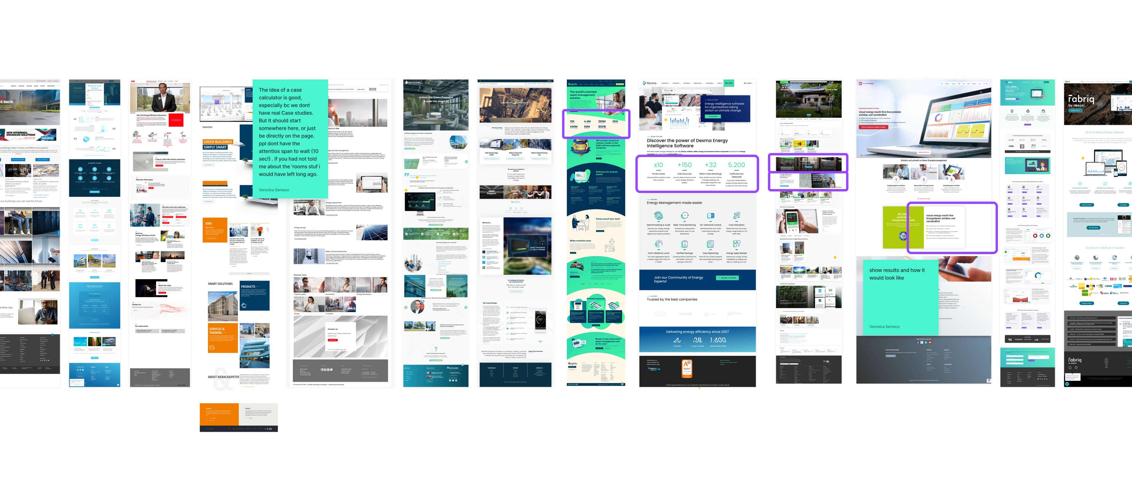
As a UX/UI designer, my role was to further the brand by defining the color palette and iconography and designing the website and other digital assets. I started by conducting research analysis on the target audience and competitors in the field. This helped me to understand the user's needs and preferences and to identify the key features that the website should have to stand out in the market.
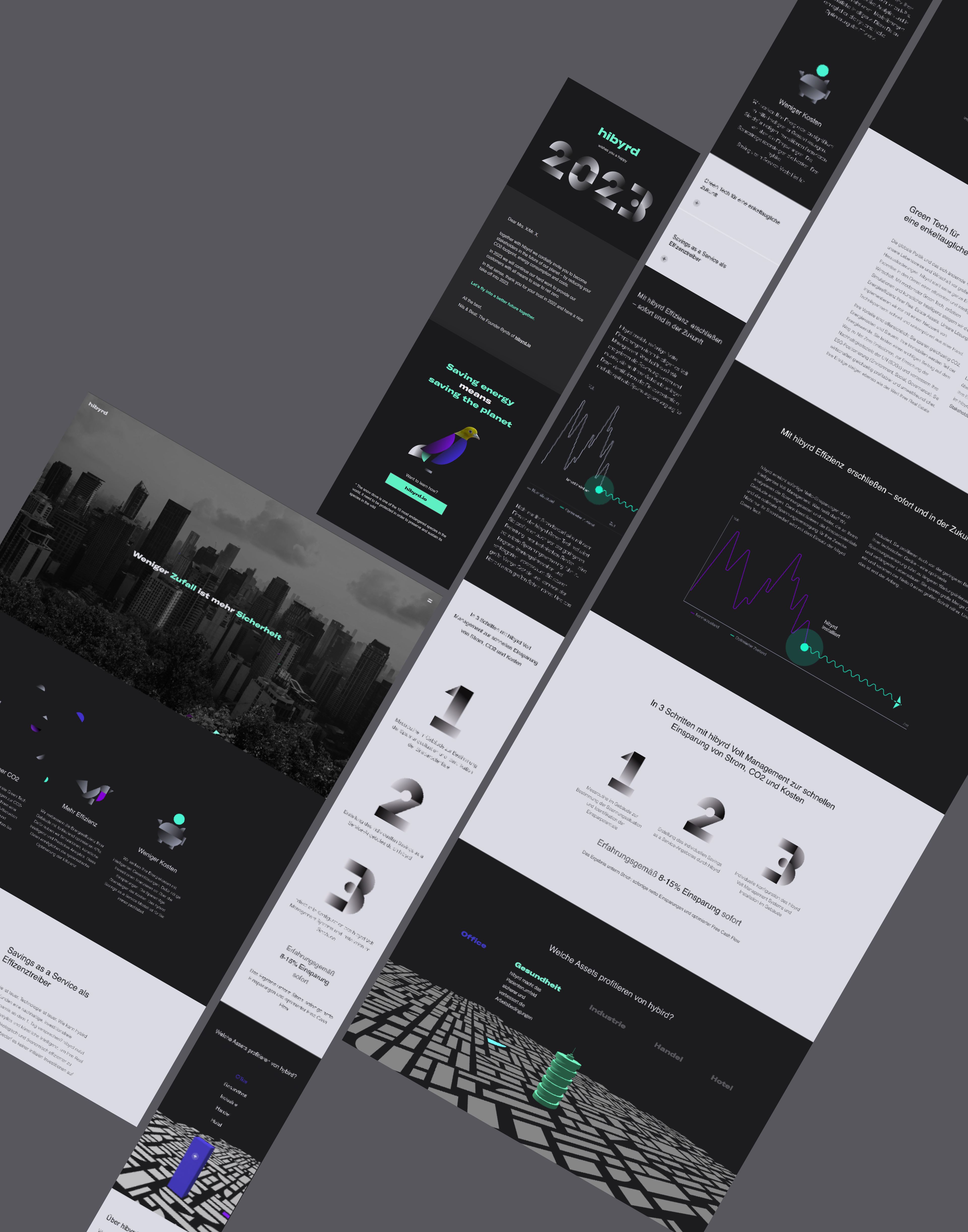
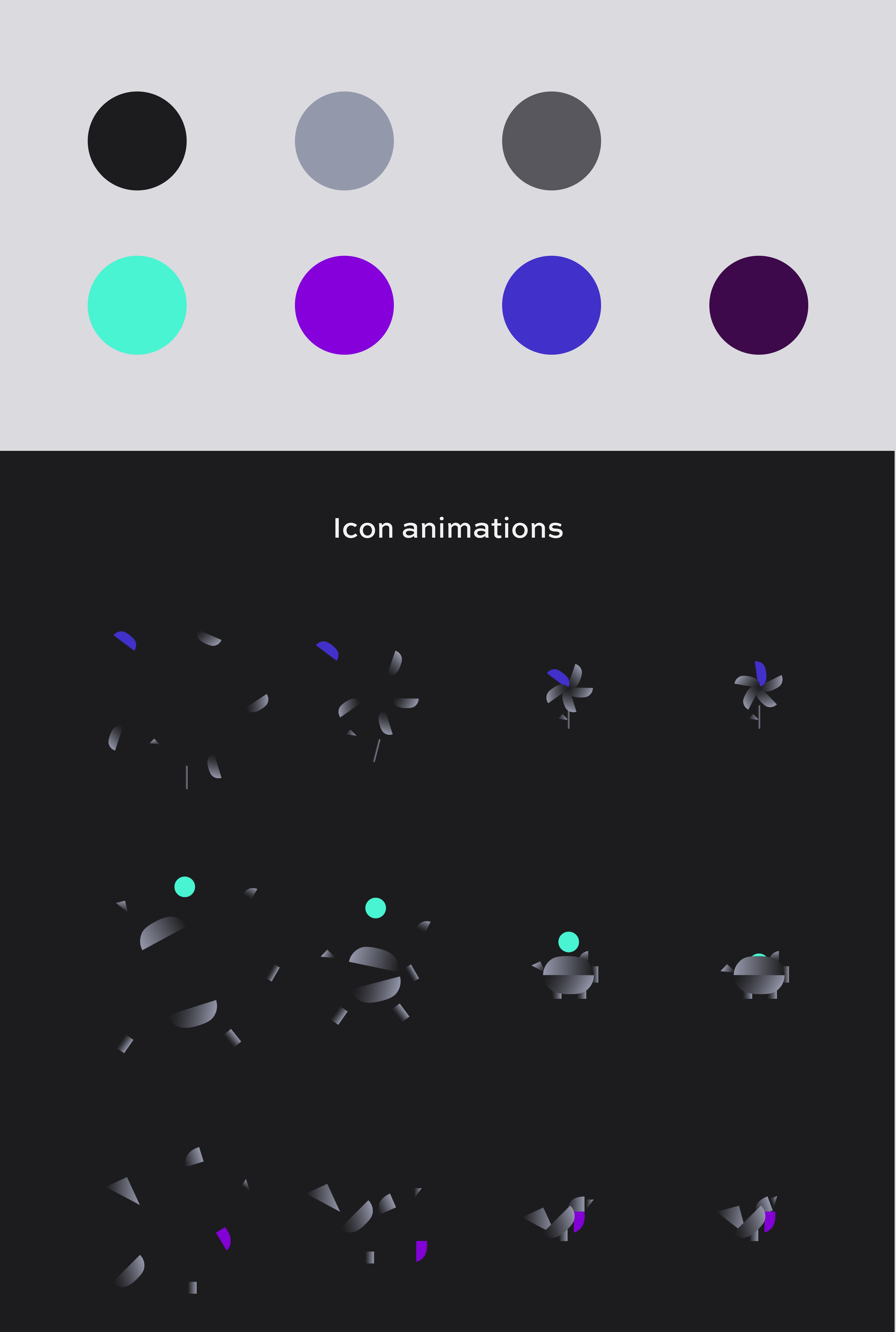
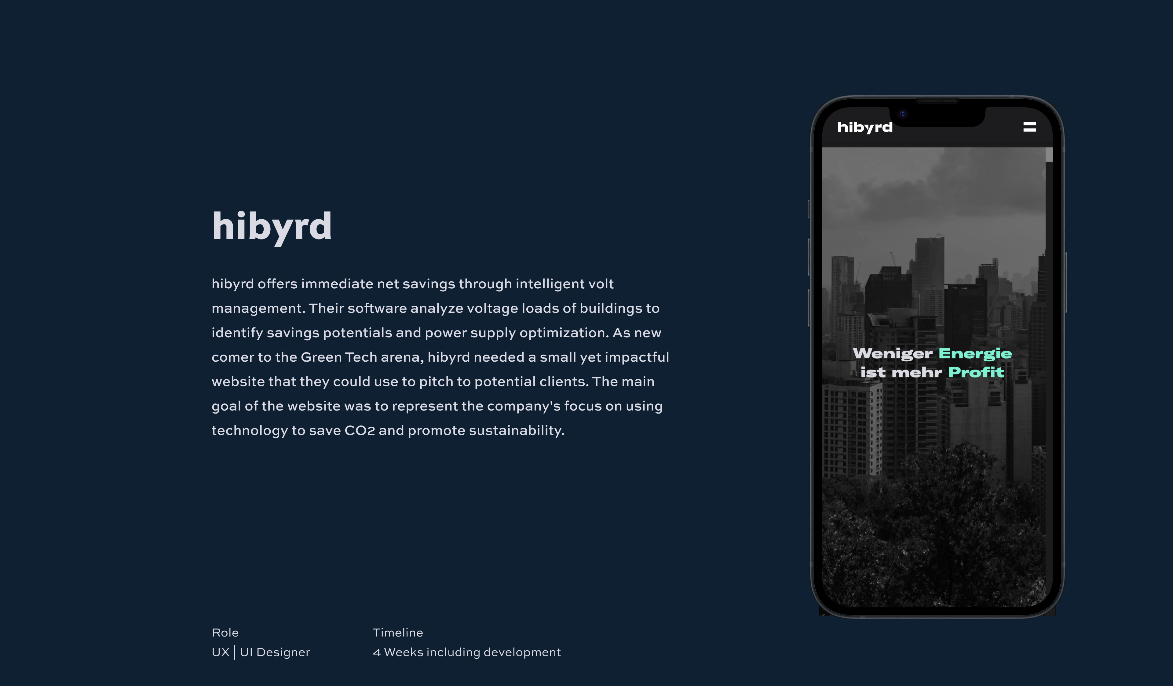
Based on my research, I designed a website that was simple, user-friendly, and visually appealing. The website features a clean layout with easy navigation and clear call-to-action buttons. The color palette was inspired by a city fauna landscape, with shades of green and blue that represented sustainability and technology. The iconography was designed to be simple and intuitive, making it easy for users to understand the company's offerings.