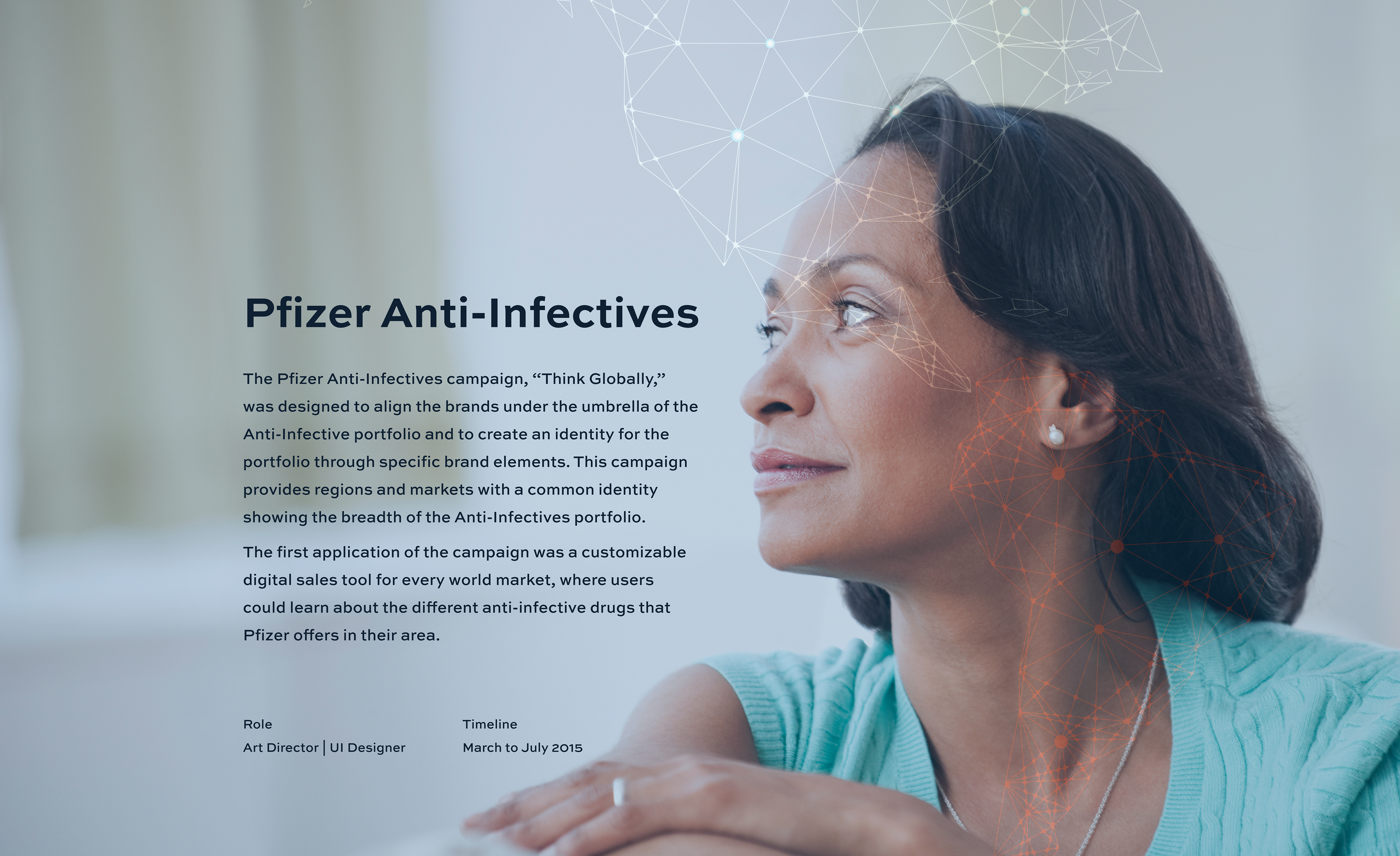

Background
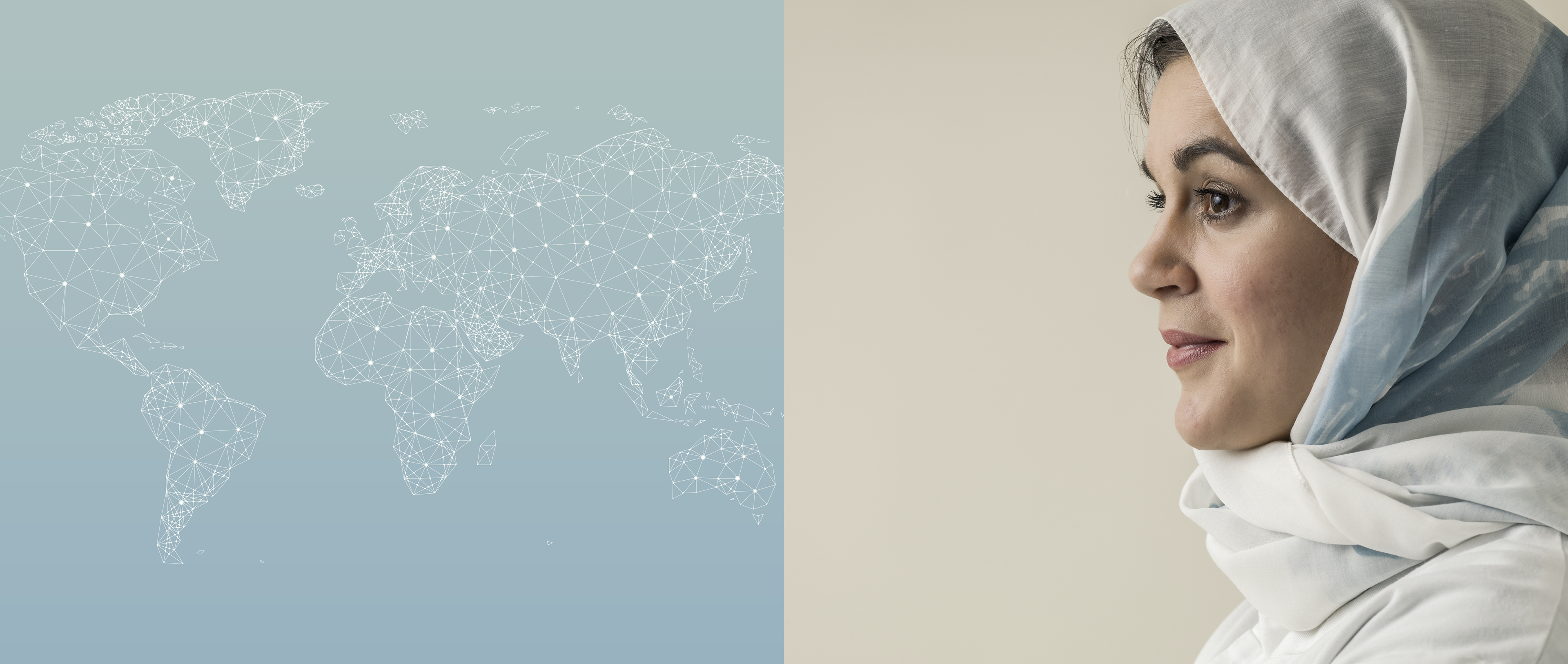
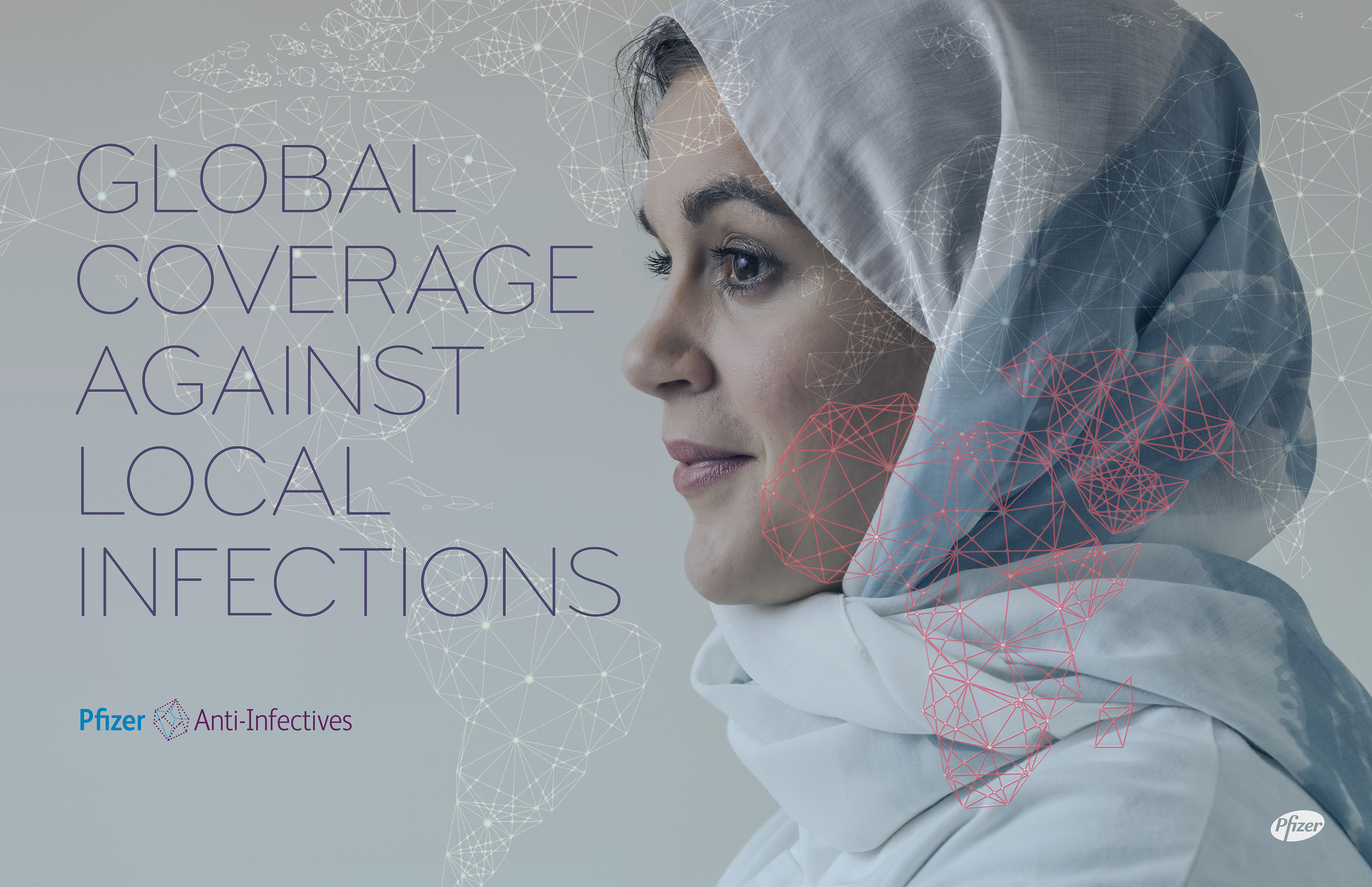
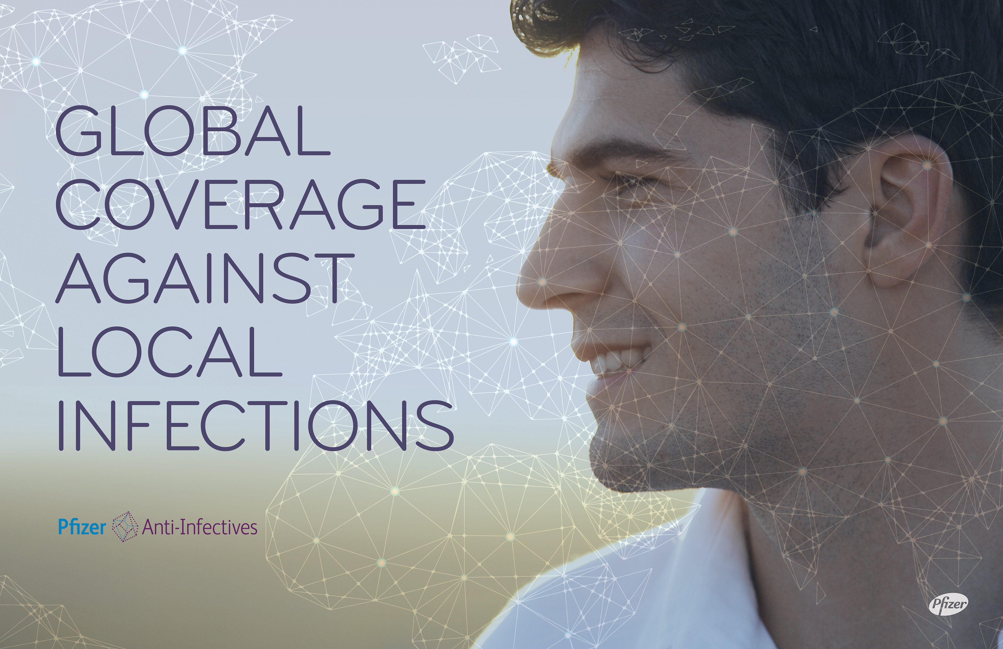
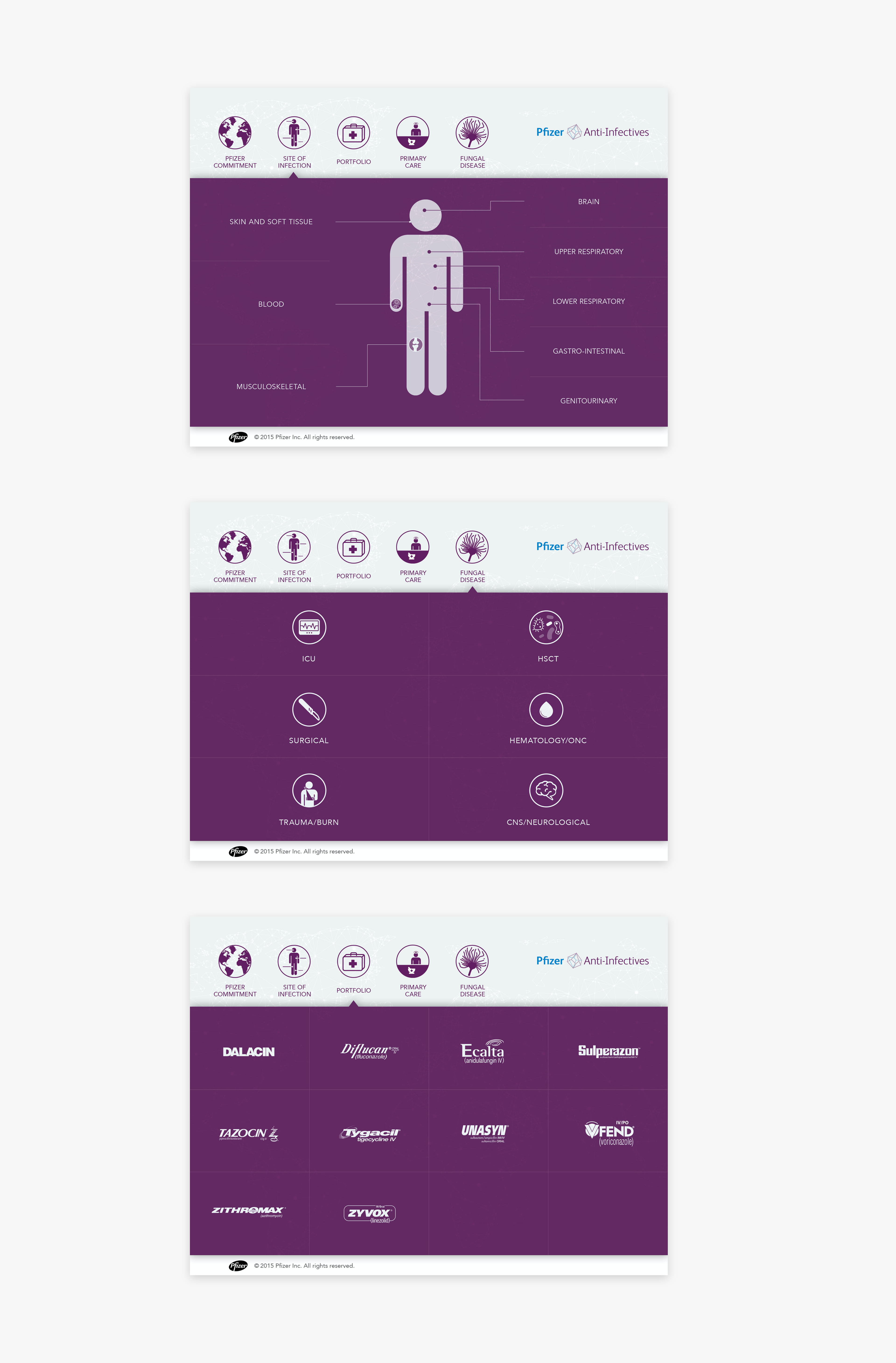
Infectious diseases vary from country to country and so do the type of treatment used to effectively treat them. This anti-infective portfolio highlights Pfizer’s experience in finding and fighting infections across the world, its ability to identify and target pandemic threats on a global scale and to work locally to eliminate them.
Each individual in each country has a unique need, so treatments need to be targeted per locality.
The campaign look & feel
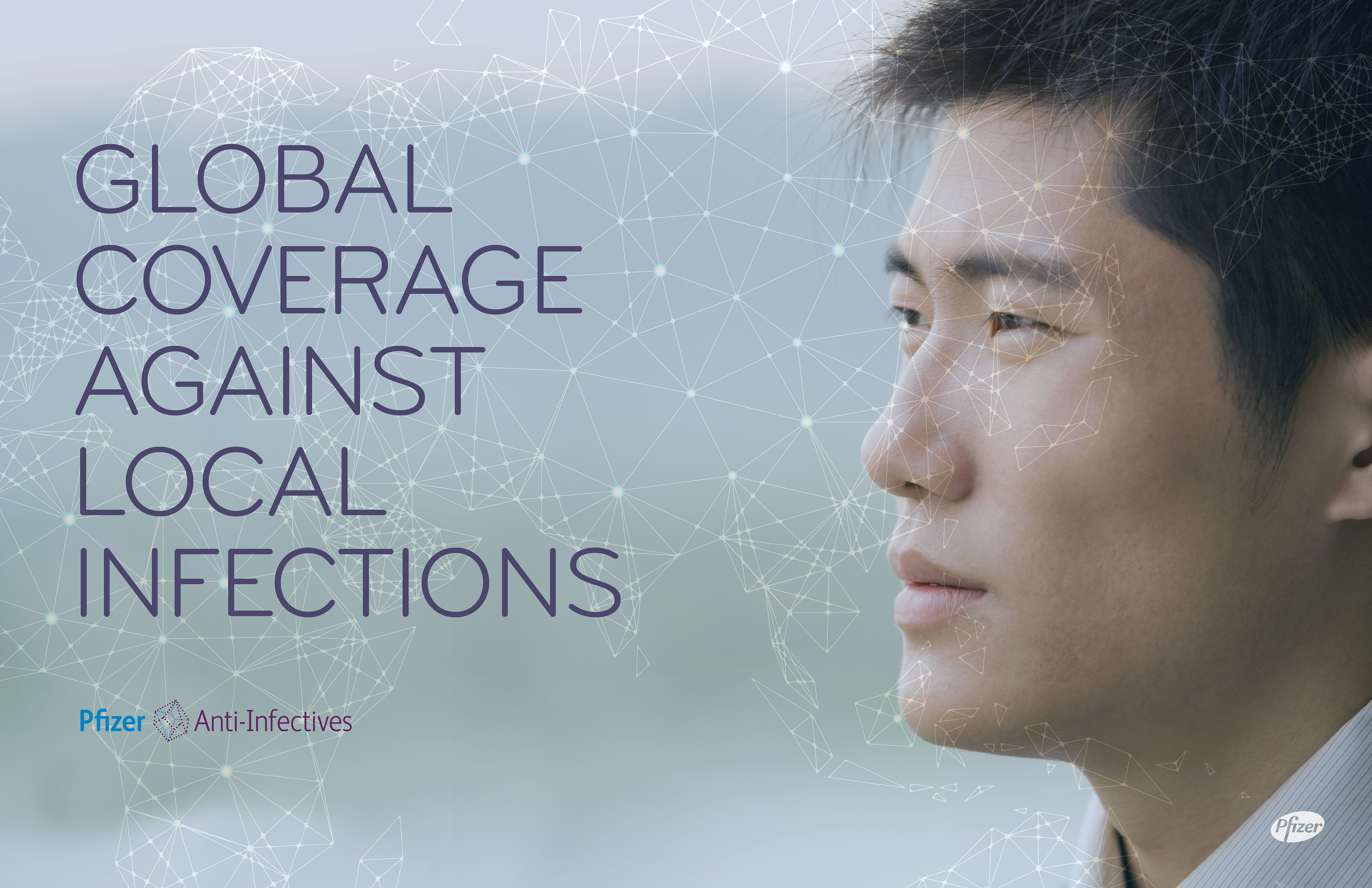
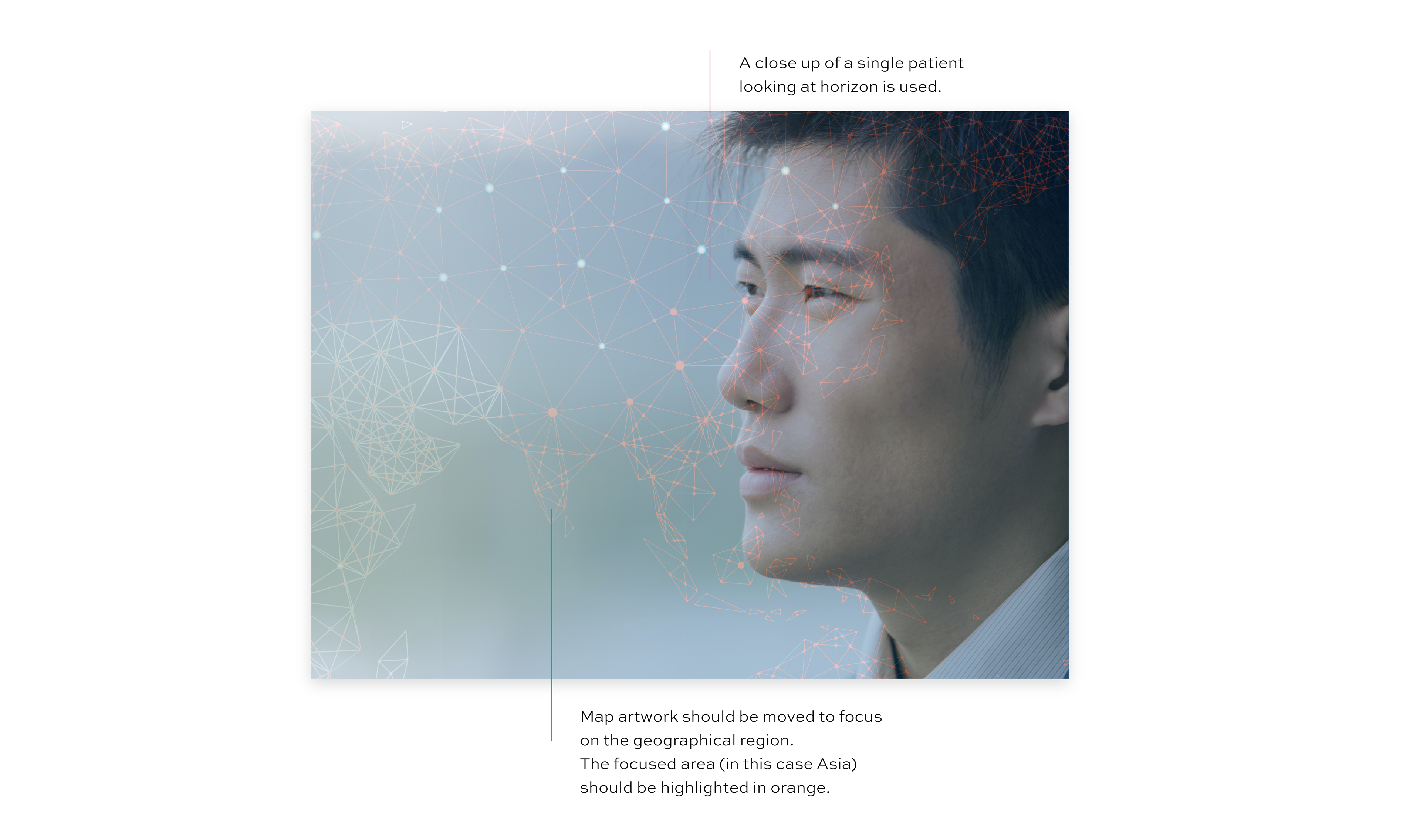
The campaign imagery is inspired by a blend of science and patient photography. It speaks to the global coverage and accessibility of the Pfizer Anti-Infective portfolio and touches on the extensive resistance monitoring being conducted worldwide. The patient imagery humanizes the campaign and ties in with the tagline of “Bringing a world of experience to every patient”.
The sales tool
From the representatives’ field team, we learned that in most foreign countries the doctors are given the tool to learn on their own instead of being presented the information as is normally the case in the US, therefore we needed the navigation to be clear and engaging, not the usual slide show.
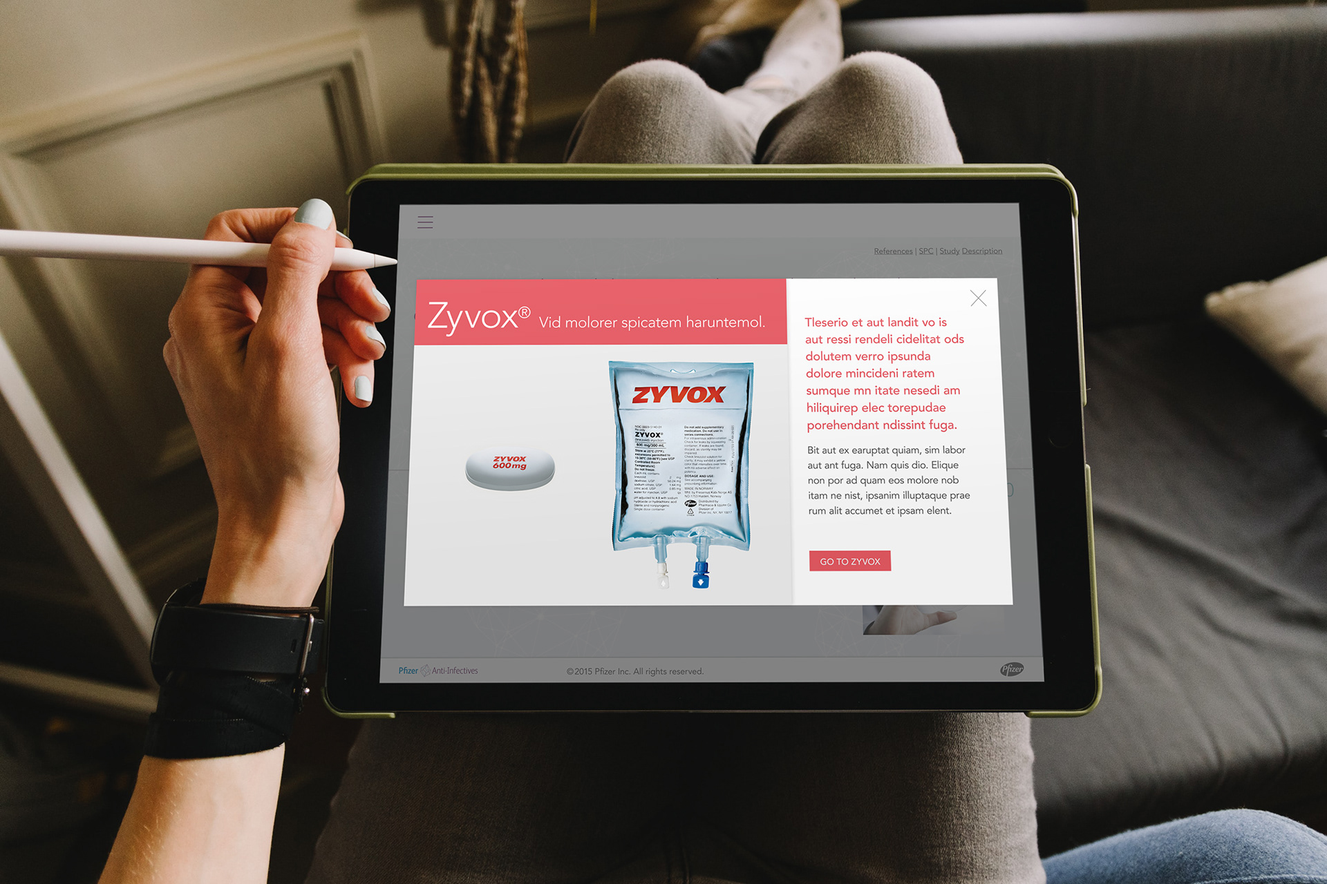
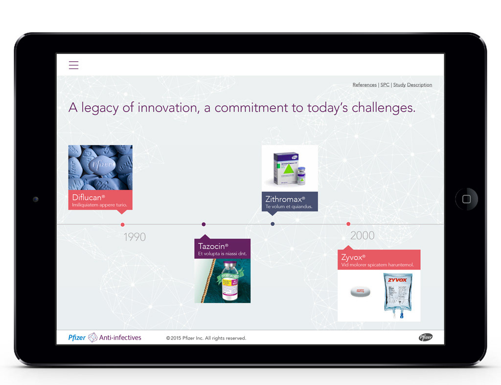
I worked together with UX designers, copywriters and developers to design a modular and flexible system with clear and to the point copy so that the sales tool could be easily translated and customized to each audience and drug availabilities in different areas of the world.
Style Guide
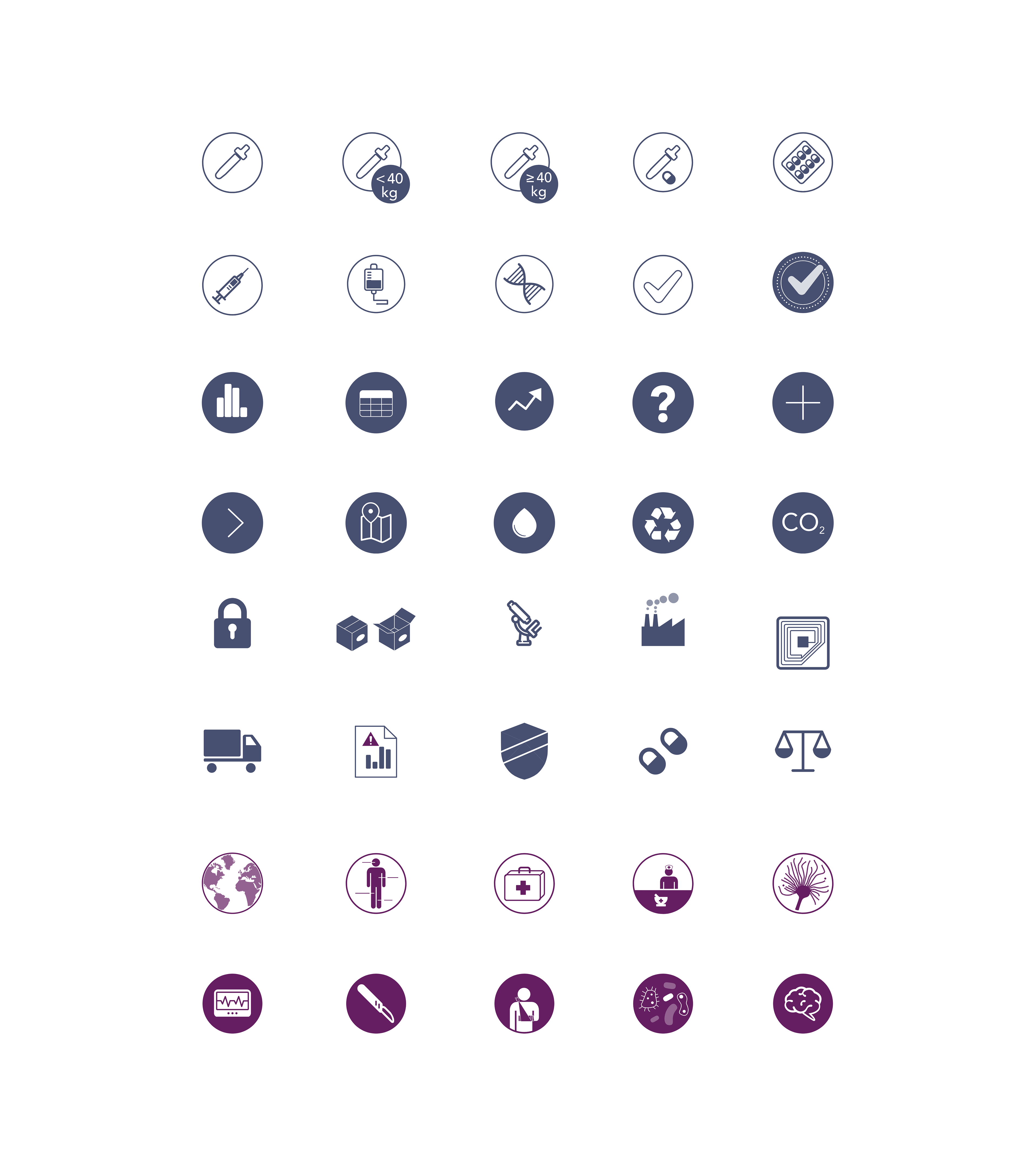
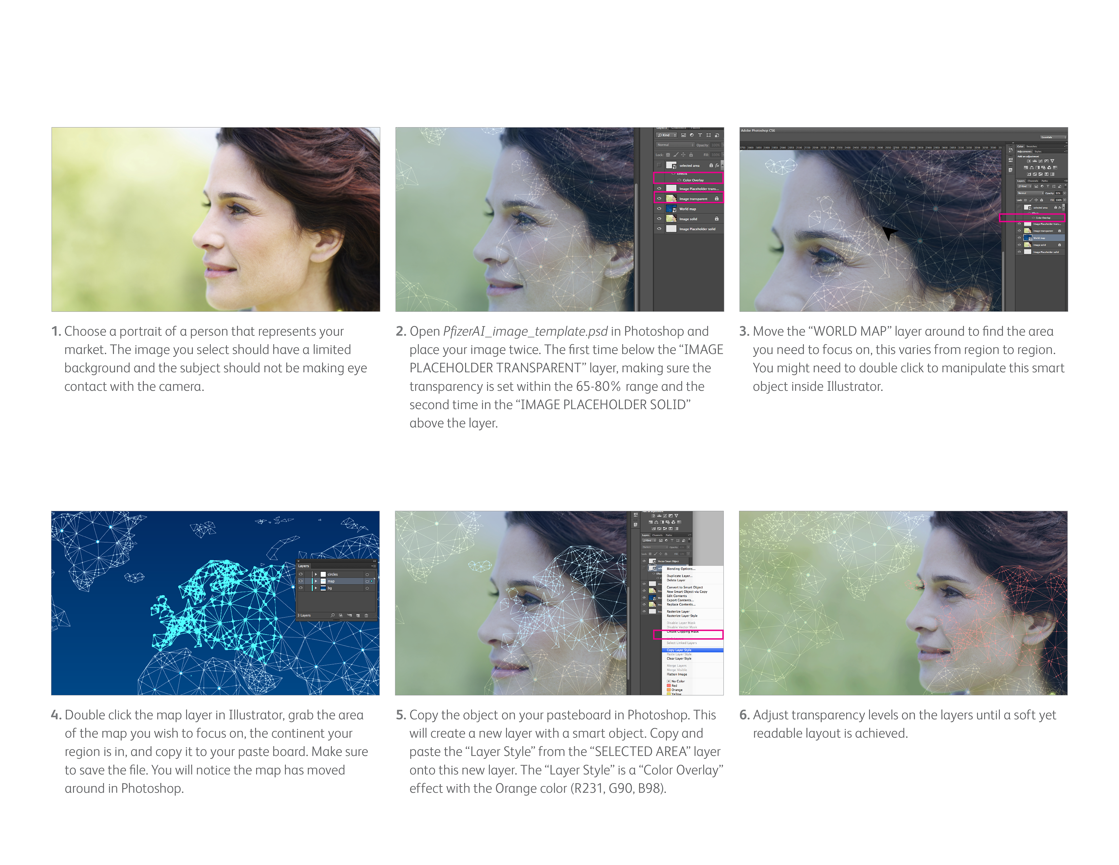
The style guide aims to aid the effective implementation of the Pfizer Anti-Infectives portfolio campaign in each region. The Style Guide shows everything from sample icon usage, logos do’s and don’ts, to a detailed step-by-step guide on recreating cover art for each market.
What I learned
I worked on this project while I working as an Art Director in the Advertising Industry. It awakened an interest in UI and UX and put a kernel to move in that direction.