These were the words that Sarah used to describe her brand. She saw Action Team Fitness as more than just fitness, rather a lifestyle that balances physical and mental health. She liked their current logo and admired brands such Mr. and Mrs. Muscle for its simplicity and ease of use, and Project by Equinox because of their brand design.
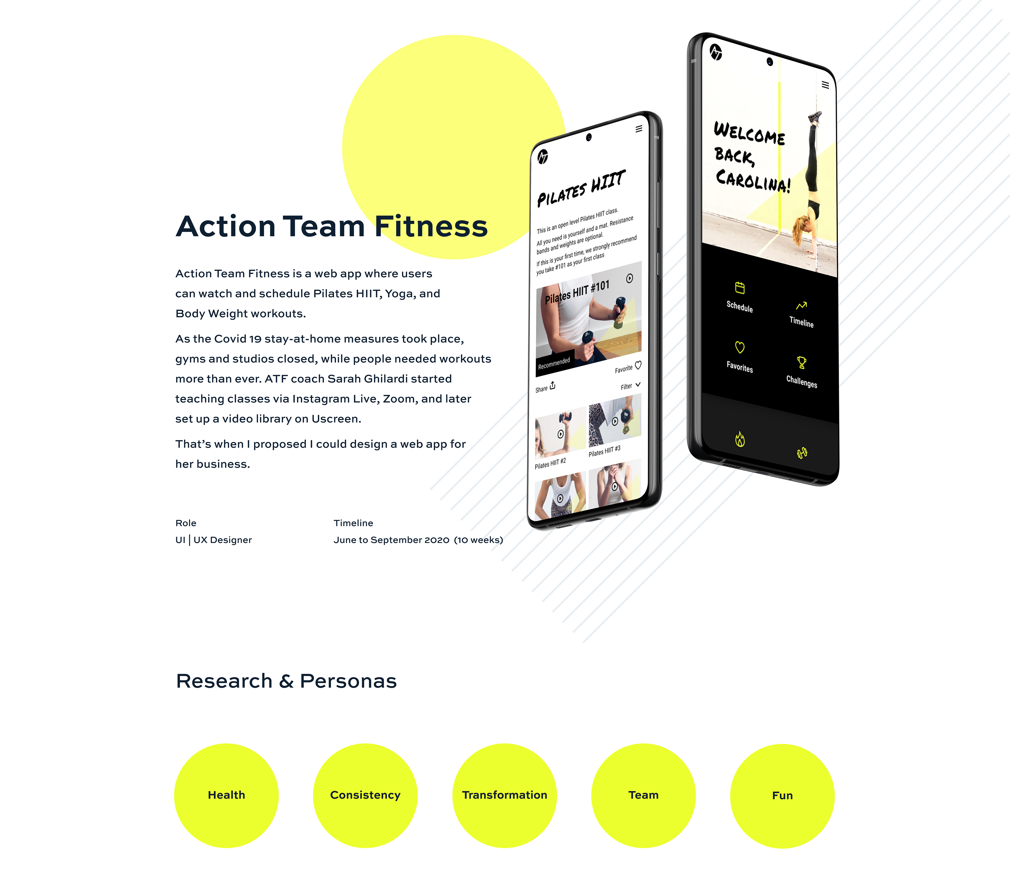
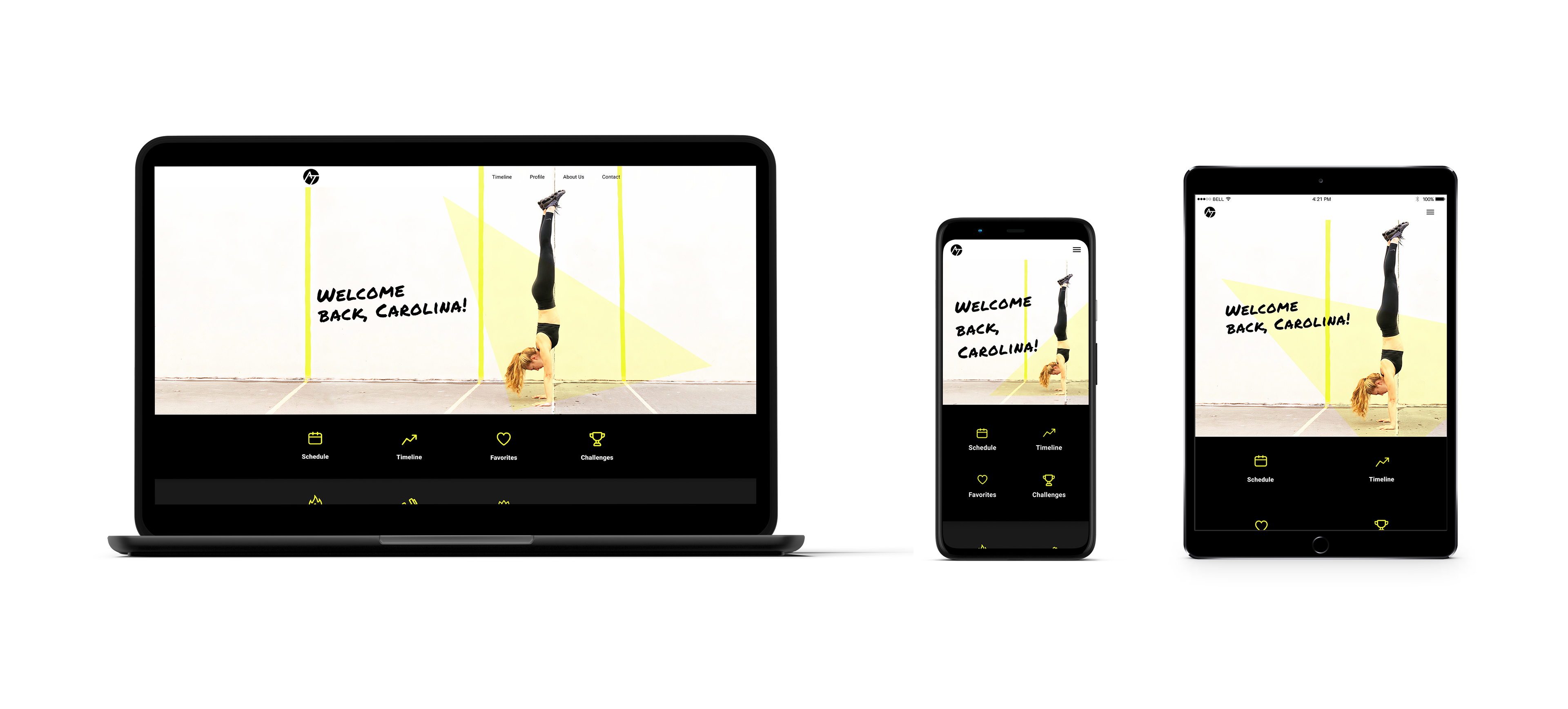
ATF needed a web app that would allow students to sign up for the Zoom group and private sessions and to watch the recorded workout videos. Bigger studios and gyms are offering virtual classes and ATF needs to be able to have a platform that will allow them to stay in the market and possibly expand it.
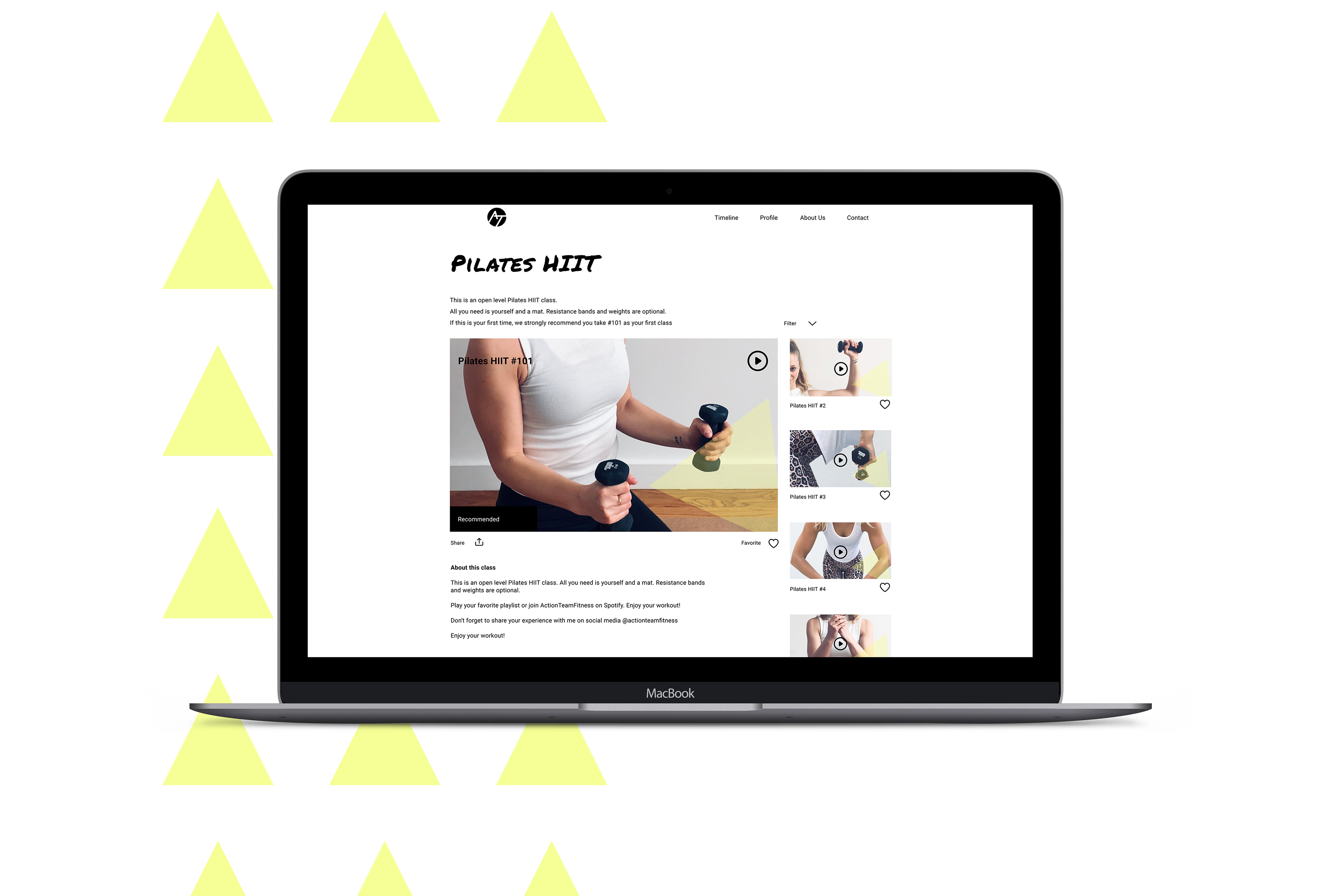
The web app should be easy to use, fun, and exciting to represent the values of Action Team Fitness and keep students coming back.
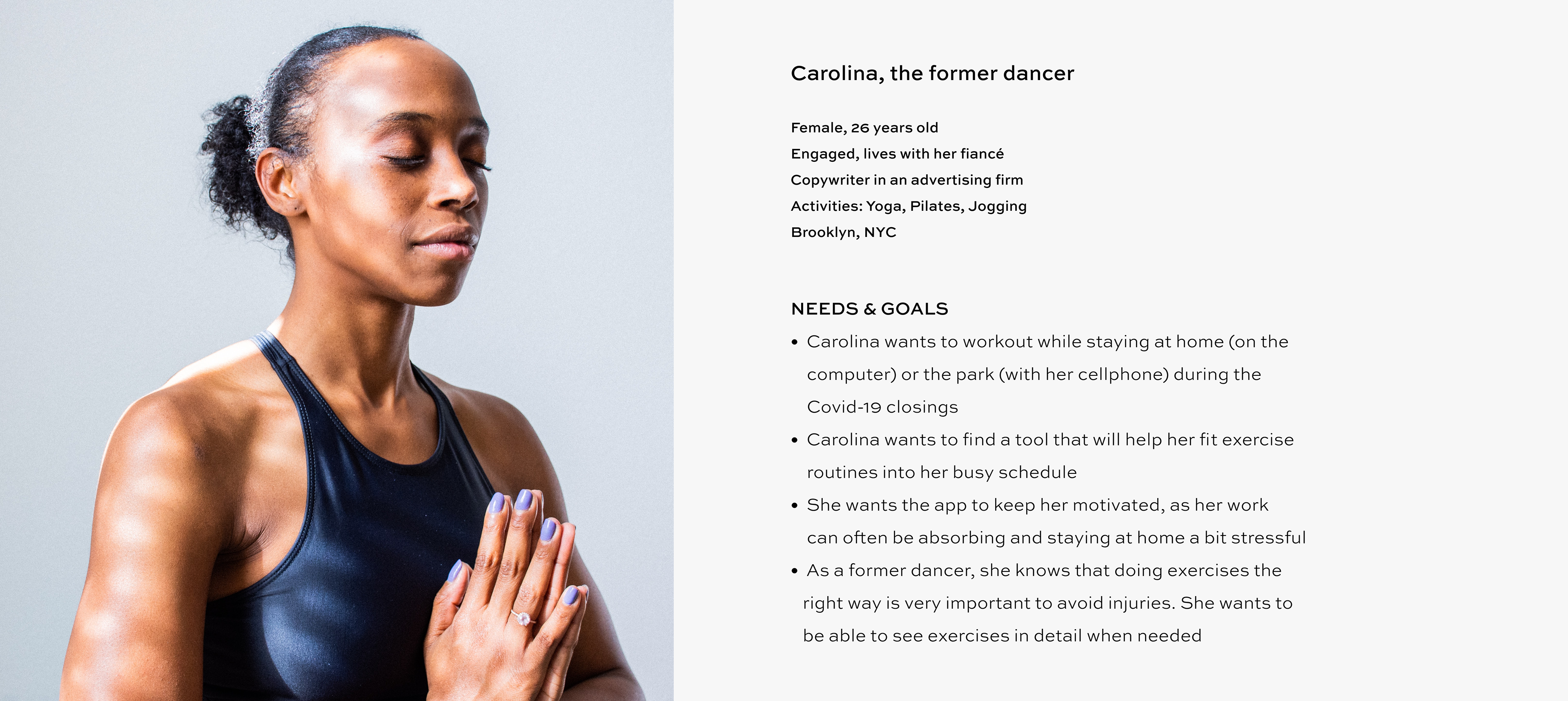
On the user end, I interviewed current users to get their point of view and create a persona that would keep the design user-focused and inspire the UI design. The good thing was, students felt the same way: they just wanted a fun and easy to use app that will allow them to schedule and watch previous videos, all in the same place.
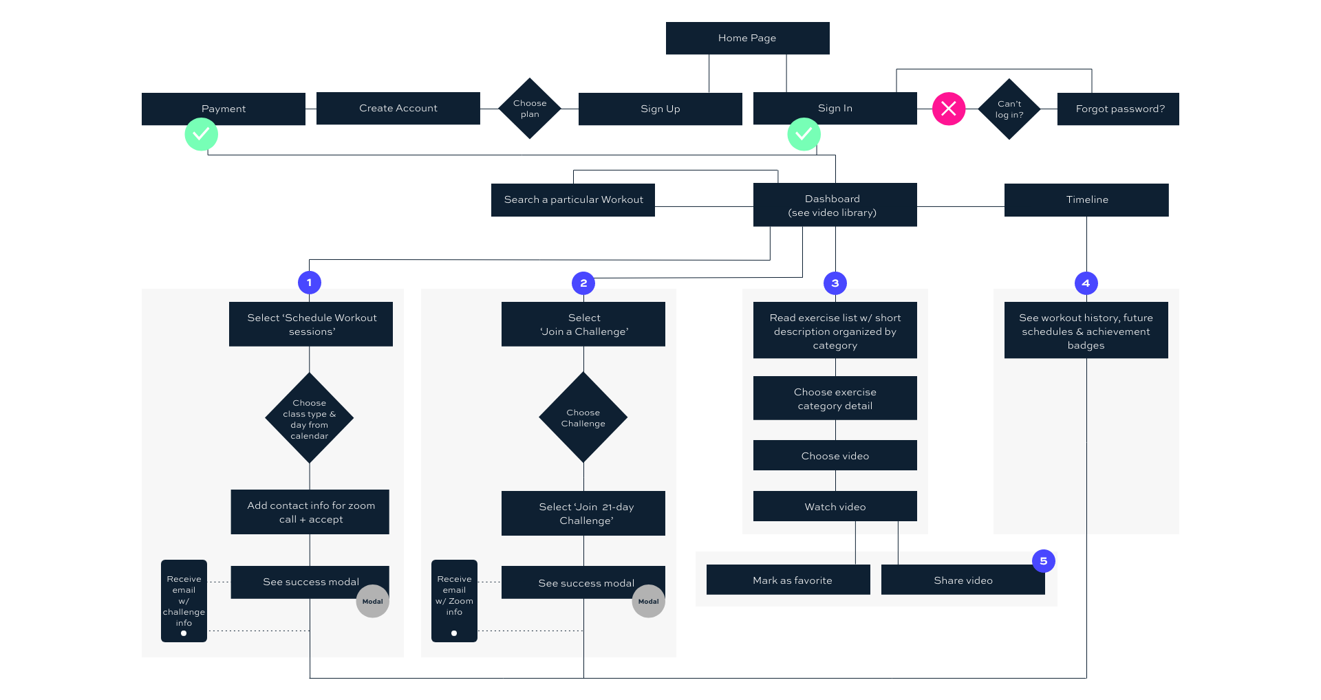
Tasks & User Flows
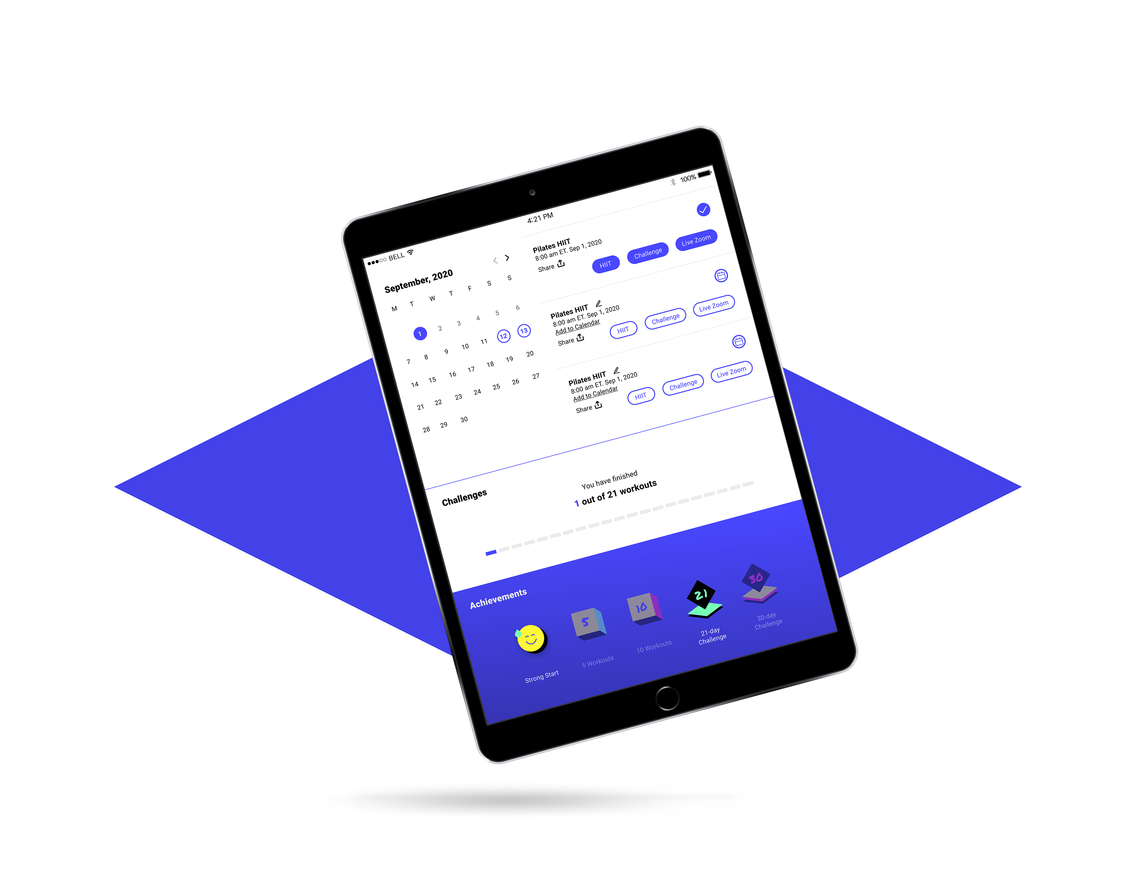
1. As a frequent user, I want to be able to schedule exercises for working out, so that I build positive habits.
2. As a frequent user, I want to complete daily challenges, so that I can have an additional way to stay motivated.
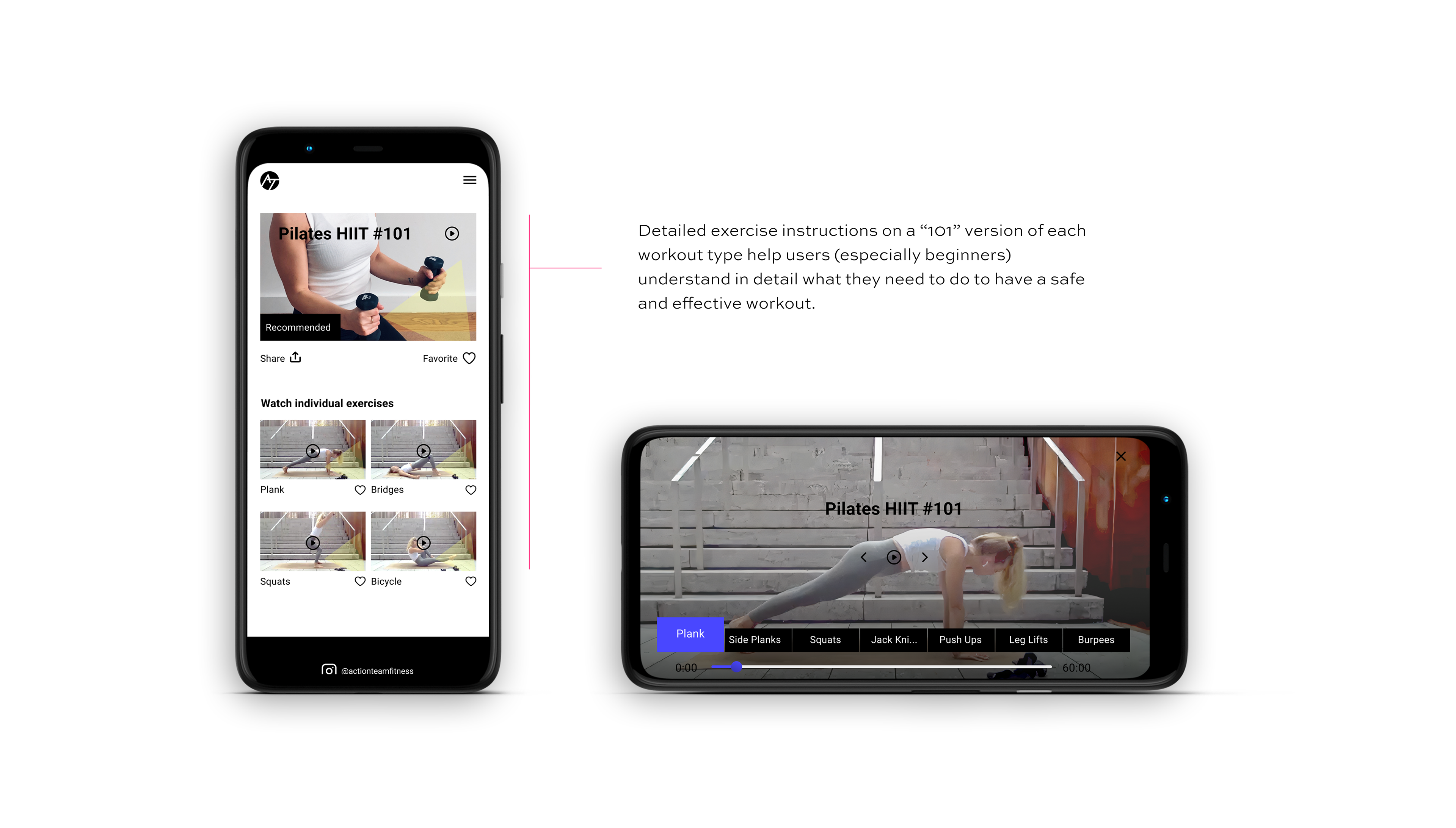
3. As a new user, I want to learn about different exercises, so that I can figure out what is best for me.
As a new user, I want to be shown how the exercises are done, so that I know I’m doing them correctly.
4. As a frequent user, I want to be able to earn achievements or rewards, so that I can stay motivated.
As a frequent user, I want to track progression and record what I’ve done, so that I can see my progress over time.
5. As a frequent user, I want to be able to share routines with my friends who may also be interested, so that I can encourage them to become healthier.
2. As a frequent user, I want to complete daily challenges, so that I can have an additional way to stay motivated.
3. As a new user, I want to learn about different exercises, so that I can figure out what is best for me.
As a new user, I want to be shown how the exercises are done, so that I know I’m doing them correctly.
4. As a frequent user, I want to be able to earn achievements or rewards, so that I can stay motivated.
As a frequent user, I want to track progression and record what I’ve done, so that I can see my progress over time.
5. As a frequent user, I want to be able to share routines with my friends who may also be interested, so that I can encourage them to become healthier.
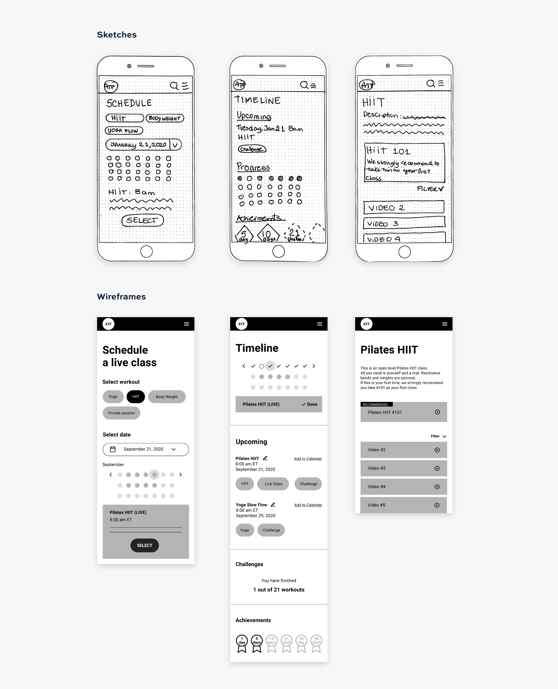
Initial Sketches & Prototypes
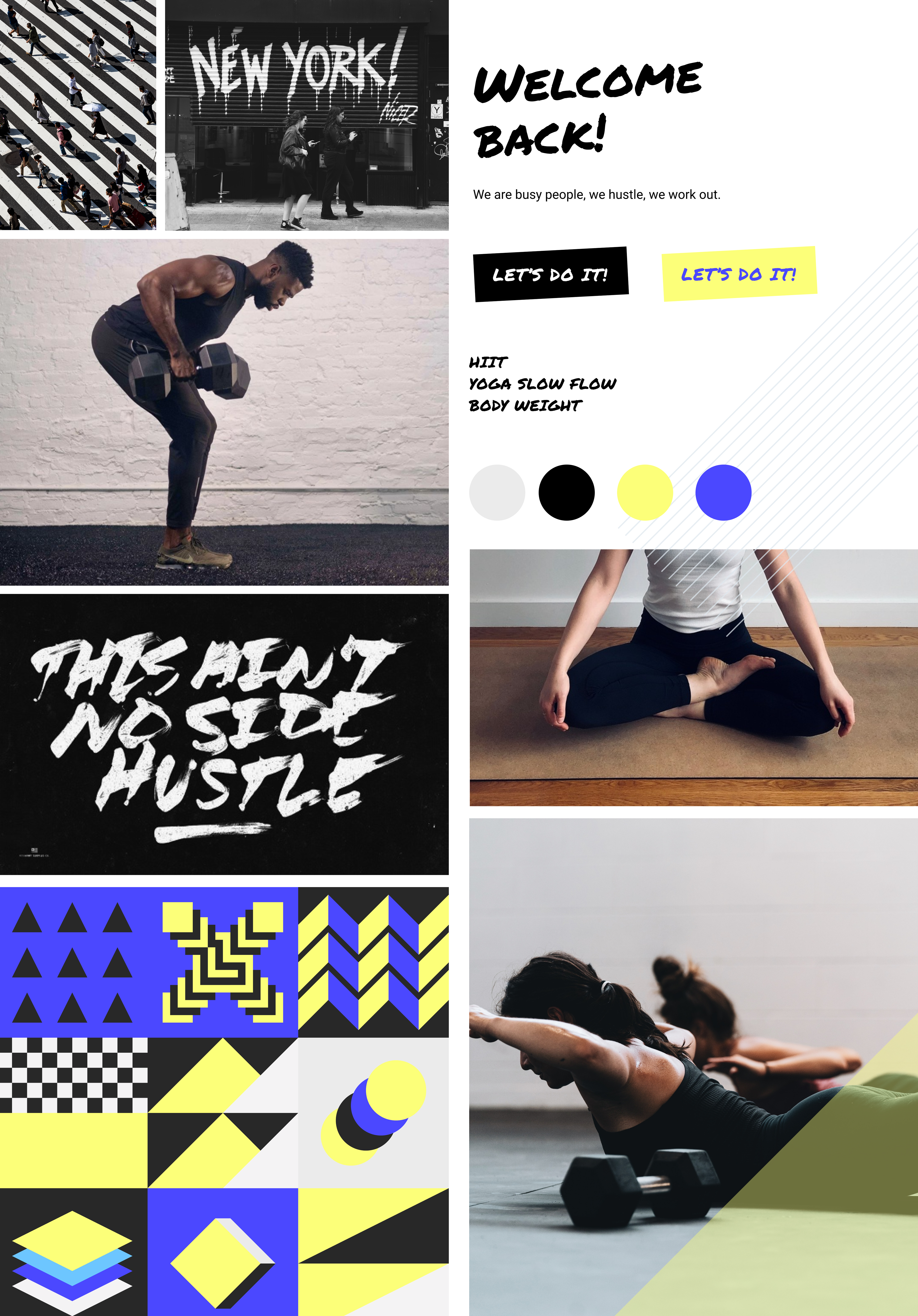
Mood Boards
After defining the user stories and wireframes, I presented mood board options based on the coach's and students' view of the brand to inspire the look and feel of Action Team Fitness’s web app.
The chosen mood board related better to the brand core values: how having fun with a workout leads to consistency and dedication, which are the only ways of obtaining results. It is fun and city-like. It is skateboarding and doing push-ups after.
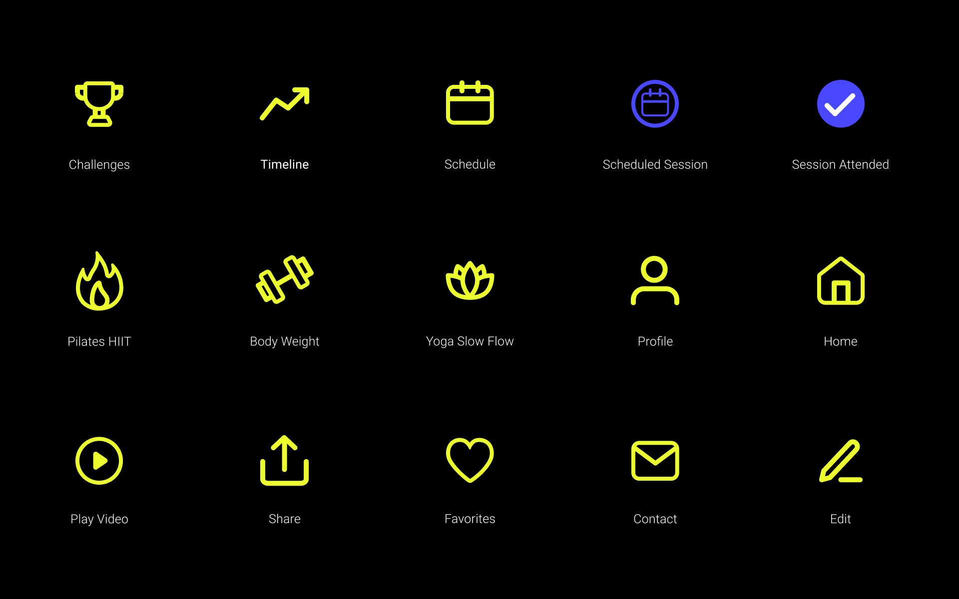
UI Design
The user interface should be easy to navigate and clear to understand so users can find what they want right away. The app's vibrant colors, typography, and graphics are inspired by the energizing and powerful workouts.
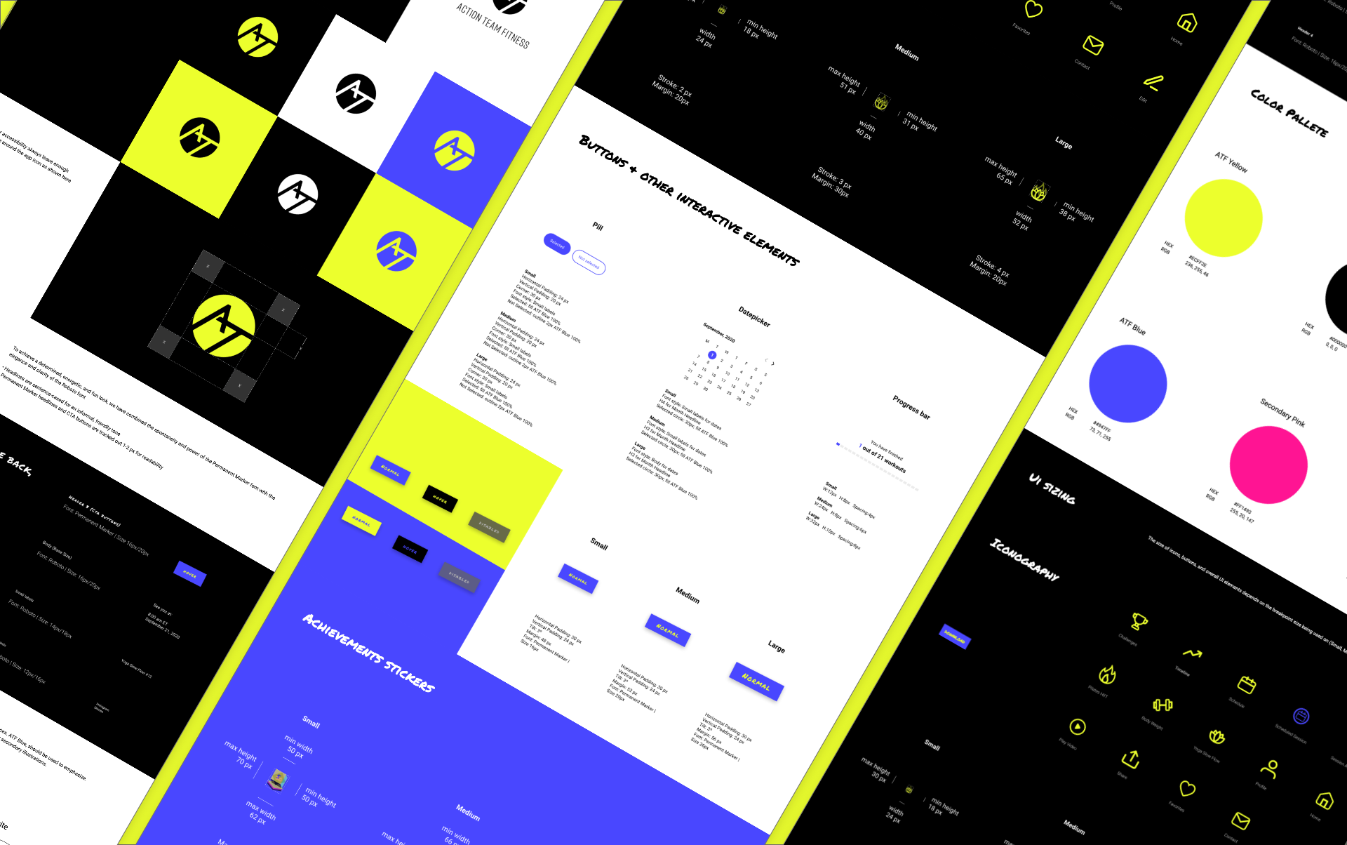
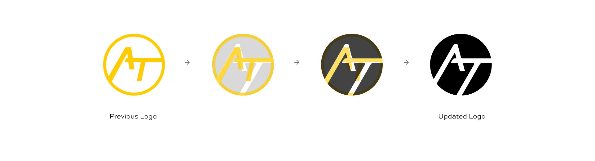
The lines of the Action Fitness Logo were slightly updated to be more dynamic, offer higher contrast, and consequently more readable.
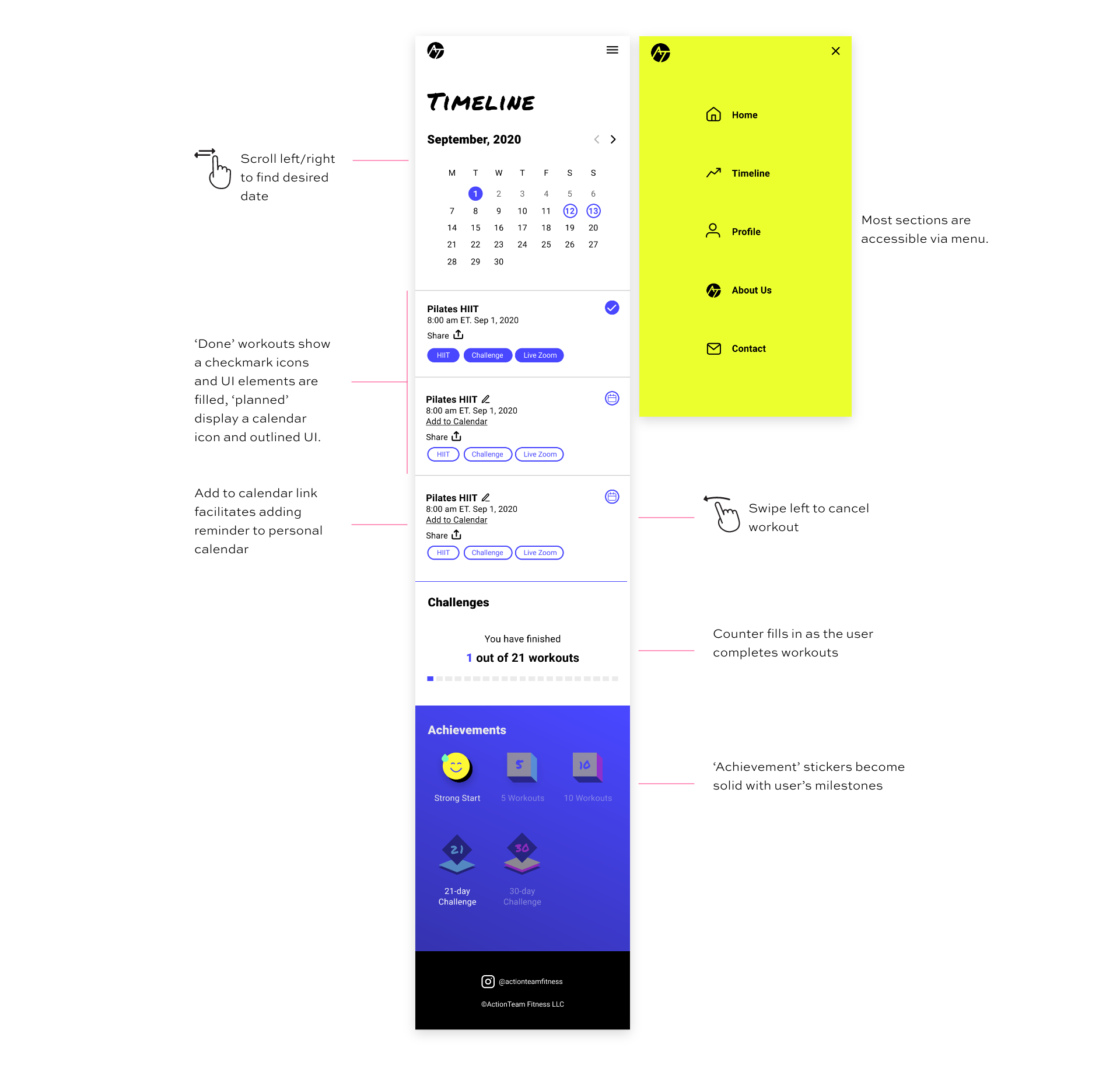
Positive Feedback
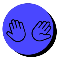
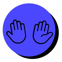
We all need motivation and feedback, especially when working out. That is why achievement stickers and fun animations on pop-ups provide positive feedback to keep user motivation up.
As I tested the animation on the left, users said that it did not look so much like a high five but more like a wave. After several attempts, the updated version moves up to look closer to a high five.
Before
After
What went well & future improvements
I used this project to deep dive into Figma because I found myself having to use the application more often on my other freelance projects. Learning a new tool has its challenges, but overall it always gives me a good feeling of accomplishment.
Close to the end of the project, I wanted to use Framer for a higher fidelity prototype. After a lot of time testing, researching, and frustration, I found out that I would have to rebuild everything again, so I had to let it go and use Figma prototyping capabilities to all their might. I was a bit disappointed, but it will help me better plan in the future.
This project also taught me to better trust my instincts and reach out to people that I am interested in working with: it might be fun and in the process, I get to design a web app!